

You’ll see a dashboard in your list if you have the View Reporting Dashboards permission and belong to a user group it was shared with. If a dashboard you expect is missing, check that you have both — ask an administrator about the permission, and whoever built the dashboard to add your group.
Open a dashboard
Open Reporting from the navigation and pick a dashboard from the side navigation. Dashboards are grouped there by category — with an Uncategorized group for the rest — so related dashboards sit together. Use Back to dashboards in the header to return to the list. Some dashboards ask for a few values before they load — an Enter parameters prompt appears, you fill it in, and the dashboard opens scoped to what you entered. Reopen it with Change parameters in the header to try different values.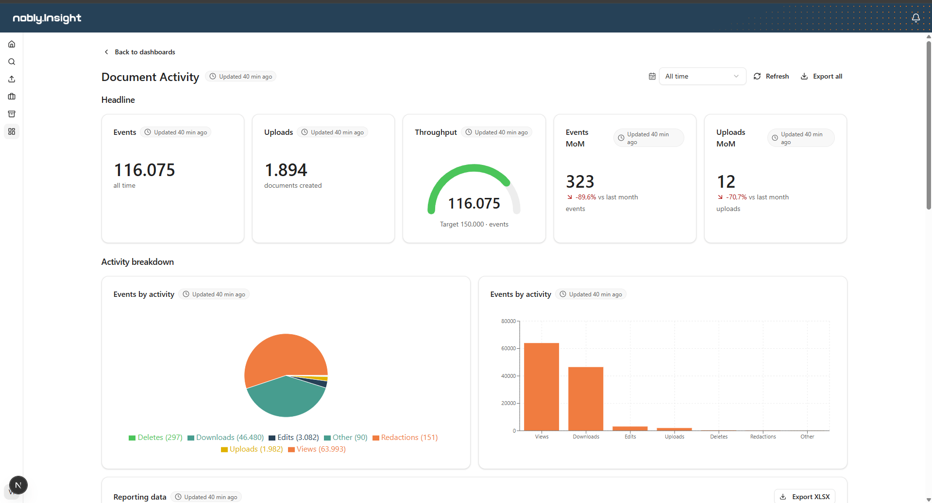
A dashboard in the viewer, with the header controls along the top.
The header controls
Along the top of every dashboard:- Date range — scopes the whole dashboard to a window (see below).
- Refresh — reloads the latest data for every element on the page.
- Export all — downloads an Excel workbook containing every table on the dashboard, scoped to the active date range.
- Freshness — Updated … shows when the underlying data was last refreshed. Each element also carries its own freshness indicator.
Scope by date range
The date range control applies to every element at once. Choose a preset:- All time
- Last 7 days, Last 30 days, Last 90 days
- This month, This year
- Custom range — pick your own start and end dates.
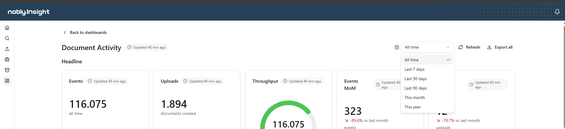
Choosing a date range scopes every element on the dashboard.
Trend value cards always compare their own configured period (for example, this month versus last month) and ignore the date range control.
Explore the data
Drill down across the dashboard
Drill down across the dashboard
Click a slice in a pie chart or a bar in a bar chart to drill down: every other element that uses the same data source narrows to that selection, so you can study one segment in context. The chart you clicked highlights your selection and offers a Clear drill-down action to remove it.
Read a pie chart
Read a pie chart
When a column has many categories, the smallest ones are grouped into a single Other slice so the chart stays readable. Hover the Other slice to see the categories behind it, and read each slice’s value from the legend.
Sort and filter a table
Sort and filter a table
Open the menu on any data grid column header to sort (ascending or descending) or filter the table by that column. A default sort may have been set when the dashboard was built, which applies until you change it. Clearing your sort returns the table to no sorting.
Read a value card
Read a value card
Value cards show one headline number. A gauge shows progress toward a target; a trend card shows the change versus the previous period, with an arrow and percentage — hover the change for exactly which periods are compared.
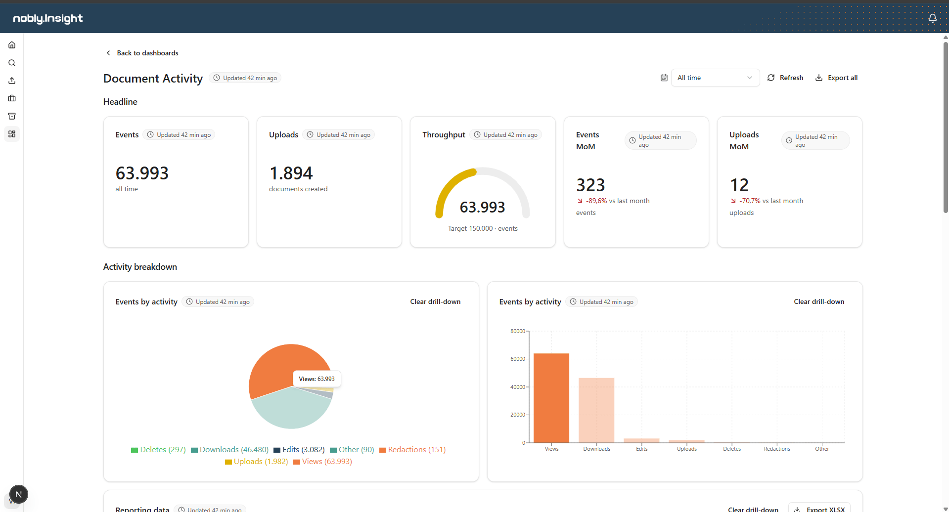
Drilling into one category filters the rest of the dashboard.
Export
- Export all (header) — every table on the dashboard, in one workbook, scoped to the active date range.
- Export XLSX on a single grid — just that table, with your current sorting and the active date range applied.
If a data source holds more rows than its row cap, the export covers only the captured rows and warns that it may be incomplete. Ask whoever manages that data source to raise its row cap if you need the full set.