

Building and editing dashboards requires the Manage Reporting Dashboards permission — held by whoever builds reporting, whether a customer administrator, super user, or consultant. You’ll also need at least one saved, refreshed data source to bind elements to.
- Visual editor — where you build the dashboard: identity, visibility, and the layout.
- Preview — a live preview of the dashboard with real data.
- JSON — the whole dashboard as JSON, for power users who want to edit or copy it directly.
Create a dashboard
1
Name and share it
Give the dashboard a clear name — this is what super users see in their list — then set the allowed user groups. Only members of those groups find it in the viewer; leaving it empty keeps the dashboard visible to reporting administrators only.
2
Pick a category
Optionally assign a category. Categories group dashboards in the viewer’s side navigation; leave it Uncategorized to place it in the catch-all group. Manage the list of categories from the Categories page in the reporting administration area.
3
Build the layout
Add sections, rows, and elements (below), watching the live result as you go, then save.
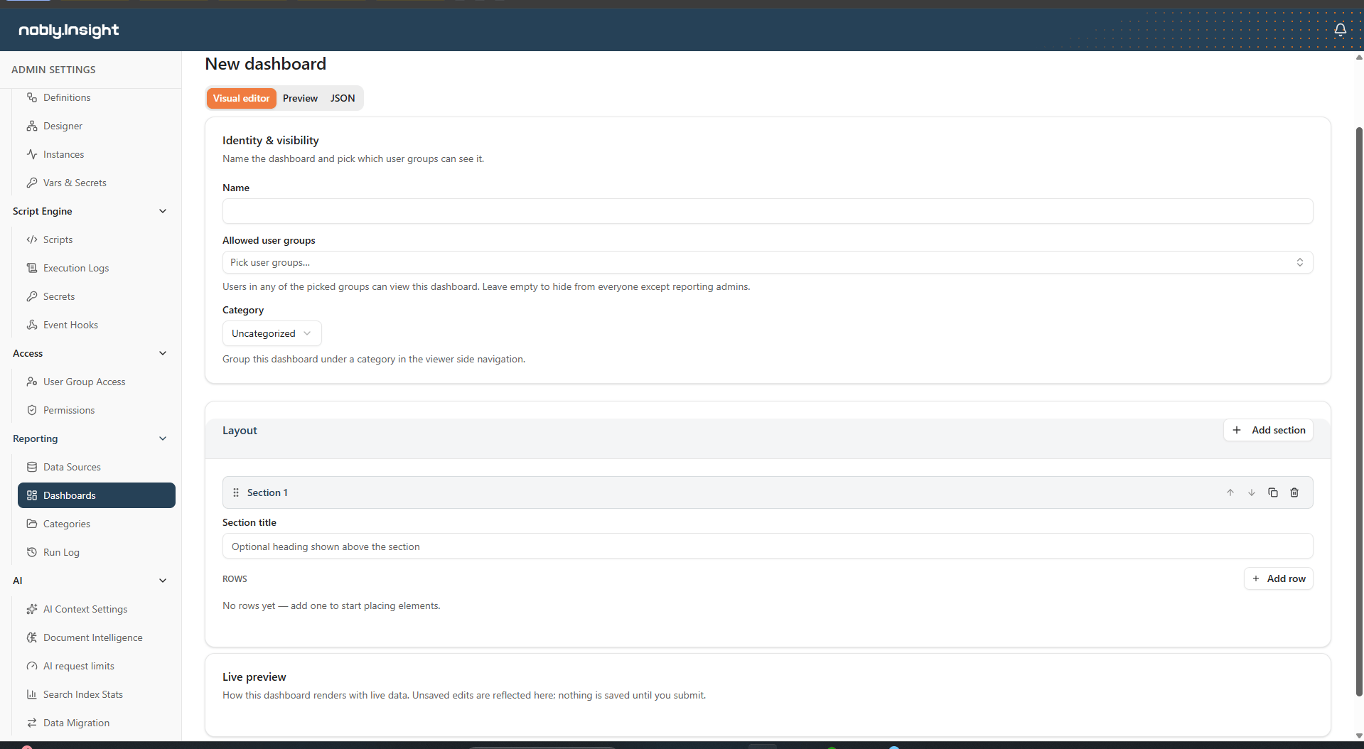
The dashboard designer: identity and visibility above the layout, with the live result rendered as you build.
Structure: sections, rows, and elements
The designer mirrors how a dashboard reads on screen:- A section is an optional titled group. Give it a heading like Headline or Activity breakdown, or leave it untitled. Sections can be reordered, duplicated, and removed.
- A row sits inside a section and holds elements side by side. Each row needs at least one element.
- An element is one value card, table, or chart, bound to a data source.
Element width: the column grid
Each row is a 12-column grid. Every element takes up a number of columns — its width span — and elements wrap to the next line when a row’s 12 columns are full. A width badge on each element (for example, 6/12) shows its current span. New elements start at a sensible default width for their type:
Drag an element’s edge to resize it — the right edge changes its width, the bottom edge its height, and the corner both — or pick a preset width (Small, Medium, Large, Full width) in its configuration. Because layout is driven by column spans, there’s no fixed limit on how many elements a row can hold — a row fits as many as their combined widths allow.
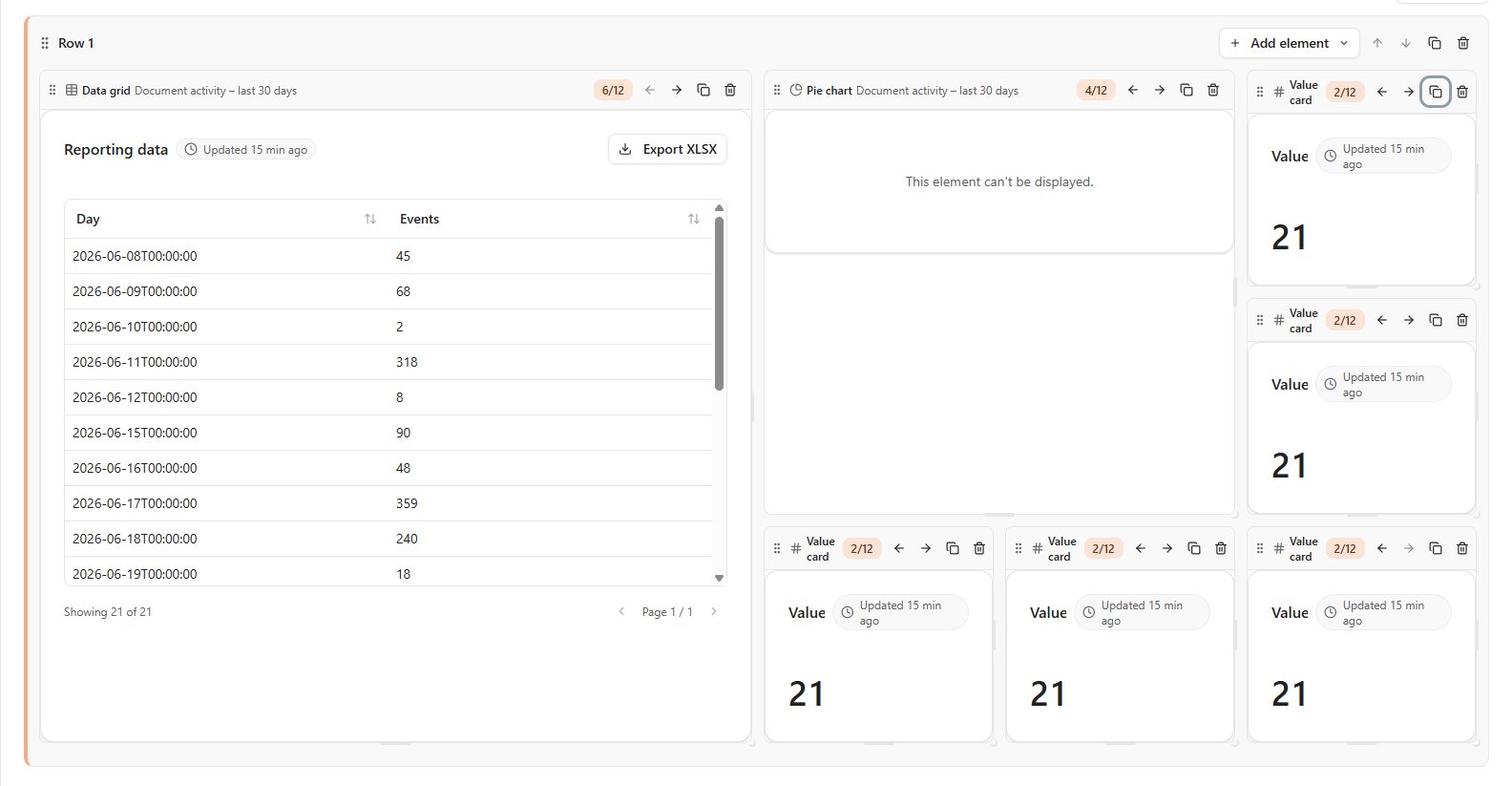
The layout canvas: elements render live inside a row, each showing its width span, with controls to resize, move, duplicate, and remove it.
Configure an element
Every element starts with a type and a data source. The rest of the configuration depends on the type and opens in a side panel when you edit the element.Value card (KPI)
Value card (KPI)
Pick a display, then fill in the fields for it. Every display also accepts an optional short label and card title.
- Number — choose an aggregate (count, sum, average, min, or max) and, for anything other than count, the value column to aggregate. Pick a number format: integer, decimal, or percent.
- Percentage — choose a column, an operator (equals, not equals, contains, greater than, less than, is empty, is not empty), and a comparison value where the operator needs one. The card shows the percentage of rows that match, with a progress bar.
- Gauge — choose an aggregate and value column, set a target, and optionally add color bands: each band colors the gauge Green, Amber, or Red up to a threshold value.
- Trend — choose an aggregate and value column, a date column to measure over, and a comparison period (This month vs last month or This year vs last year). The card shows the current period’s total and the change versus the previous period.
Data grid
Data grid
- Columns — leave empty to show every column, or list specific columns; the order you list them is the column order shown.
- Page size — rows shown per page.
- Default sort — optionally pick a column and direction to sort by until the viewer changes it.
- Conditional formatting — add rules that color a row or text, or show an icon, when a column matches an operator/value. Rules are evaluated in order; the first match wins.
- Click action — optionally make rows open the related record (a Caseflow object, a document, or a URL built from the row’s values).
Pie and Bar charts
Pie and Bar charts
- Group-by column — the category each slice or bar represents.
- Aggregate — count, sum, or average. For sum and average, also pick the value column to aggregate.
- Time bucket (bar charts only) — when the group-by column is a date, bucket it by day, week, month, quarter, or year.
- Title — an optional heading shown above the chart.
- Click action — like a data grid, optionally make a slice or bar open the related record (a Caseflow object, a document, or a URL built from the row’s values).
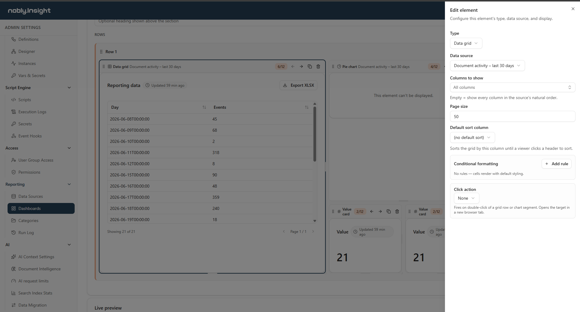
The element configuration panel: pick the type and data source, then the options for that element — here, a data grid's columns, page size, sort, conditional formatting, and click action.
Preview and JSON
Two tabs sit alongside the visual editor:- Preview renders the dashboard exactly as a viewer will see it, with live data and the same date-range and parameter controls. Unsaved edits show up here immediately — nothing is saved until you submit — so you can check a layout before committing to it. A dashboard whose sources take runtime parameters prompts for them here, just as it will in the viewer.
- JSON shows the whole dashboard — name, allowed user groups, category, and layout — as JSON. Valid edits sync back to the visual editor, and you can copy a dashboard’s JSON to reproduce it elsewhere. You can’t save while the JSON is invalid; the editor tells you what to fix.
Save and publish
When you save, the layout is validated. Saving is blocked if:- a row has no elements,
- two elements share the same identifier,
- a section title is too long, or
- the JSON tab holds edits that aren’t valid.