

What is Reporting?
Reporting is the dashboard layer in Nobly Insight. It turns the data behind your solution into dashboards — pages of charts, tables, and value cards that update on demand and stay scoped to a date range you choose. Reporting has two sides, each gated by a permission rather than a job title — whoever holds the permission can use it, whether they’re a customer administrator, super user, or consultant:Building
With the Manage Reporting permissions, create the data sources (the queries that feed reporting) and design the dashboards — choosing sections, layout, elements, and how each element is configured.
Viewing
With the View Reporting Dashboards permission, view and explore the finished dashboards — switching the date range, drilling into a chart, sorting and filtering tables, and exporting the data.
How the pieces fit together
A dashboard is built from a small set of concepts. Reading them top to bottom mirrors how you build one:1
Data source
A named, saved query that returns rows and columns. You author it once; every element that needs that data points at it. A data source refreshes on a schedule, or takes runtime parameters the viewer fills in when the dashboard opens. See Data sources.
2
Dashboard
A page that belongs to your solution and is made visible to chosen user groups. A dashboard can be grouped under a category, which organizes the viewer’s side navigation.
3
Section
An optional titled group inside a dashboard (for example, Headline and Activity breakdown). Sections give a dashboard structure and headings.
4
Row
A horizontal band inside a section. A row holds one or more elements side by side.
5
Element
A single chart, table, or value card bound to a data source. Elements are the building blocks you actually see on screen.
Element types
Every element is one of four types. The type is chosen per element when the dashboard is built; viewers simply read them.Value card (KPI)
Value card (KPI)
A single headline number, shown in one of four displays:
- Number — a scalar aggregate (count, sum, average, min, or max) of a column.
- Percentage — the percentage of rows that match a condition, with a progress bar.
- Gauge — a value against a target, with optional colored threshold bands.
- Trend — the current period’s total with a delta versus the previous period (month-over-month or year-over-year).
Data grid
Data grid
A sortable, filterable table of rows. Supports a configured default sort, conditional formatting, and a click action that opens the related record.
Pie chart
Pie chart
A breakdown of one value across categories. High-cardinality data collapses the long tail into a single Other slice you can hover to see the split.
Bar chart
Bar chart
A comparison of one value across categories, optionally bucketed by day, week, month, quarter, or year when grouped on a date.
Dashboard-wide behavior
A few features apply across every element on a dashboard:- Date range — a single control in the header scopes every element to the chosen window. Each element finds its own date column automatically; elements without one are left unscoped. Trend value cards keep their own period and ignore this control.
- Drill-down (cross-filter) — clicking a slice or bar filters the other elements that share the same data source, so you can explore one segment without leaving the page.
- Freshness — each element shows when its data source was last refreshed, so you always know how current the numbers are.
- Export — export the whole dashboard, or a single grid, to an Excel workbook scoped to the active date range.
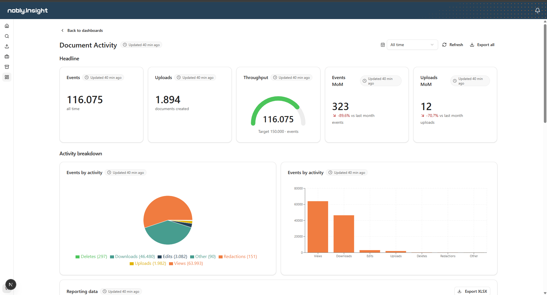
A reporting dashboard in the viewer: a titled section of value cards above a section of charts.
Where to go next
Data sources
Author, test, and refresh the queries that feed reporting.
Building dashboards
Design dashboards: sections, rows, elements, and per-element configuration.
Viewing dashboards
Open, filter, explore, and export dashboards.