> ## Documentation Index
> Fetch the complete documentation index at: https://docs.insight.nobly.dk/llms.txt
> Use this file to discover all available pages before exploring further.
# Introduction to Reporting
> Understand reporting dashboards in Nobly Insight — how data sources, dashboards, and elements fit together for the people who build and view them.
## What is Reporting?
Reporting is the dashboard layer in Nobly Insight. It turns the data behind your solution into **dashboards** — pages of charts, tables, and value cards that update on demand and stay scoped to a date range you choose.
Reporting has two sides, each gated by a permission rather than a job title — whoever holds the permission can use it, whether they're a customer administrator, super user, or consultant:
With the **Manage Reporting** permissions, create the **data sources** (the queries that feed reporting) and **design the dashboards** — choosing sections, layout, elements, and how each element is configured.
With the **View Reporting Dashboards** permission, **view and explore** the finished dashboards — switching the date range, drilling into a chart, sorting and filtering tables, and exporting the data.
## How the pieces fit together
A dashboard is built from a small set of concepts. Reading them top to bottom mirrors how you build one:
A named, saved query that returns rows and columns. You author it once; every element that needs that data points at it. A data source refreshes on a schedule, or takes **runtime parameters** the viewer fills in when the dashboard opens. See [Data sources](/reporting/data-sources).
A page that belongs to your solution and is made visible to chosen user groups. A dashboard can be grouped under a **category**, which organizes the viewer's side navigation.
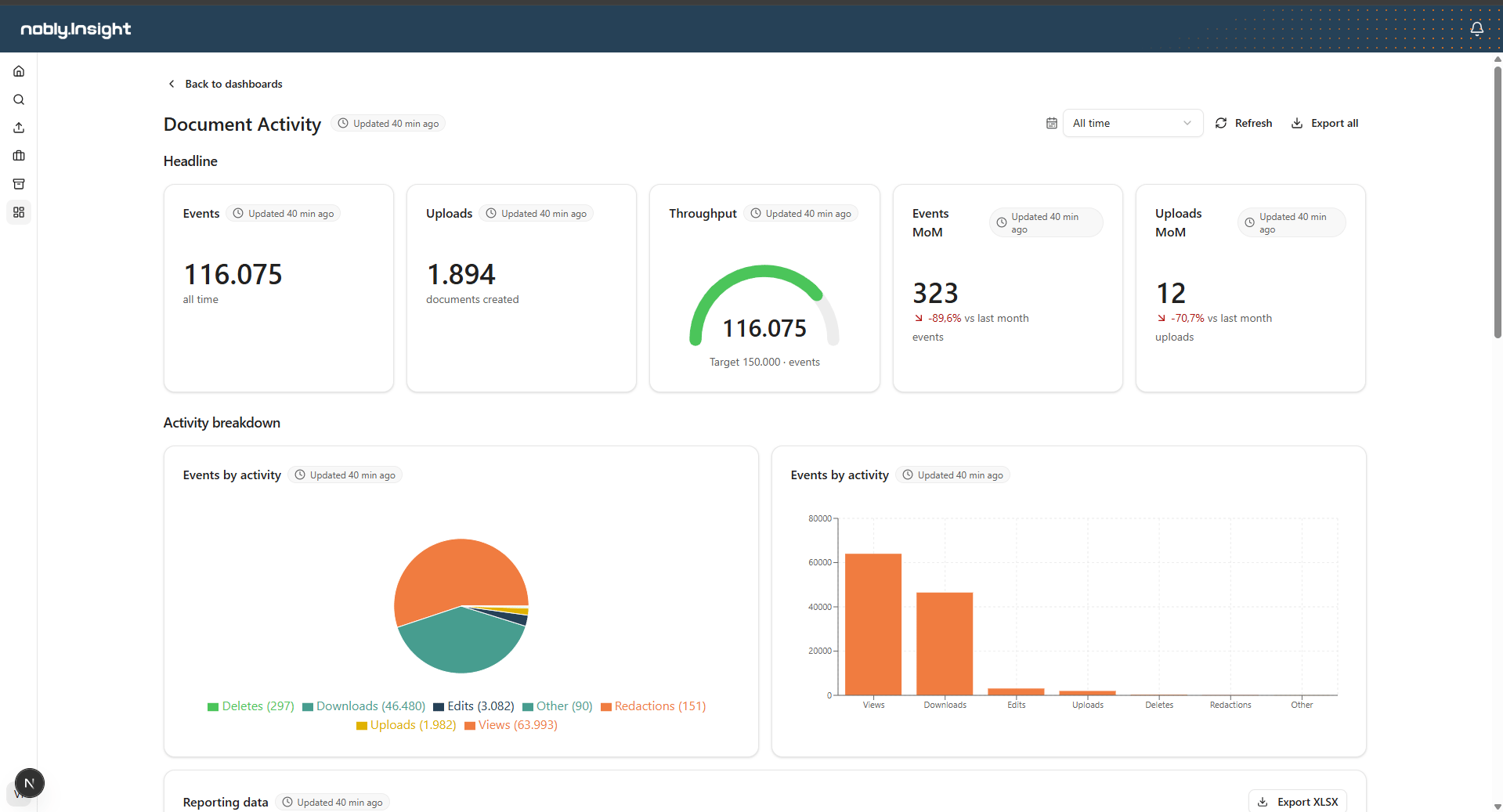
An optional titled group inside a dashboard (for example, *Headline* and *Activity breakdown*). Sections give a dashboard structure and headings.
A horizontal band inside a section. A row holds one or more elements side by side.
A single chart, table, or value card bound to a data source. Elements are the building blocks you actually see on screen.
## Element types
Every element is one of four types. The type is chosen per element when the dashboard is built; viewers simply read them.
A single headline number, shown in one of four displays:
* **Number** — a scalar aggregate (count, sum, average, min, or max) of a column.
* **Percentage** — the percentage of rows that match a condition, with a progress bar.
* **Gauge** — a value against a target, with optional colored threshold bands.
* **Trend** — the current period's total with a delta versus the previous period (month-over-month or year-over-year).
A sortable, filterable table of rows. Supports a configured default sort, conditional formatting, and a click action that opens the related record.
A breakdown of one value across categories. High-cardinality data collapses the long tail into a single **Other** slice you can hover to see the split.
A comparison of one value across categories, optionally bucketed by day, week, month, quarter, or year when grouped on a date.
## Dashboard-wide behavior
A few features apply across every element on a dashboard:
* **Date range** — a single control in the header scopes every element to the chosen window. Each element finds its own date column automatically; elements without one are left unscoped. Trend value cards keep their own period and ignore this control.
* **Drill-down (cross-filter)** — clicking a slice or bar filters the other elements that share the same data source, so you can explore one segment without leaving the page.
* **Freshness** — each element shows when its data source was last refreshed, so you always know how current the numbers are.
* **Export** — export the whole dashboard, or a single grid, to an Excel workbook scoped to the active date range.
 ## Where to go next
Author, test, and refresh the queries that feed reporting.
Design dashboards: sections, rows, elements, and per-element configuration.
Open, filter, explore, and export dashboards.
## Where to go next
Author, test, and refresh the queries that feed reporting.
Design dashboards: sections, rows, elements, and per-element configuration.
Open, filter, explore, and export dashboards.