> ## Documentation Index
> Fetch the complete documentation index at: https://docs.insight.nobly.dk/llms.txt
> Use this file to discover all available pages before exploring further.

# Form templates

> Design the preview, create and update templates that show, capture and edit a document type's form documents.

Form templates are HTML with form components, designed per document type under **Settings → Documents → Form templates**. They use the same template engine and the same editor as [Caseflow templates](/caseflow/templates), so variables, conditionals and loops work the way you already know; only the components and the render scope are different, because a form template addresses a document's keywords rather than a Caseflow object's attributes.

## Before you begin

You need the **View form configuration** permission to open the list and the **Manage form configuration** permission to create, edit, restore or delete templates. See [administration](/forms/administration) for the whole permission family and for which document types qualify.

## Template types

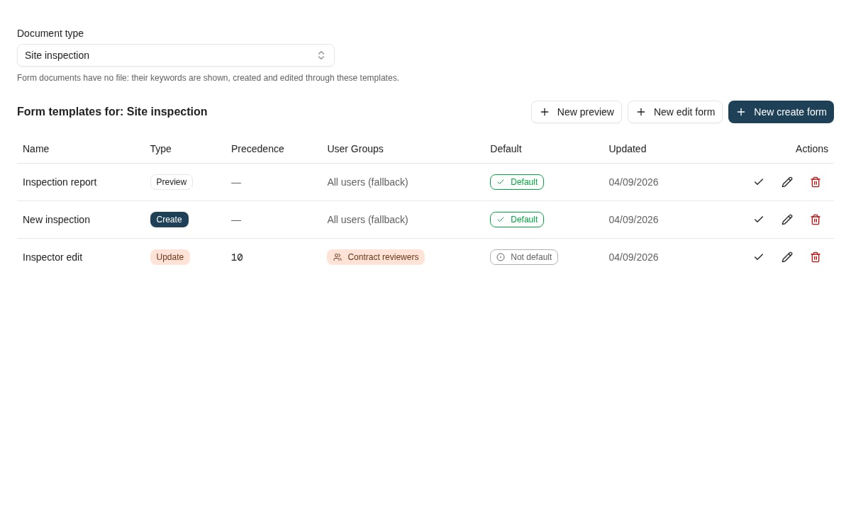
A document type can hold any number of templates of three types. Each type covers one situation; a document type needs at least a **create** template before anyone can create form documents in it, and a **preview** template to show existing ones the way you want.

| Type        | Used when                                                    | Fields                                                  |
| ----------- | ------------------------------------------------------------ | ------------------------------------------------------- |
| **Preview** | Search preview and the viewer show an existing form document | Read-only — `KeywordValue` and interpolated values      |
| **Create**  | Someone creates a new form document from **New form**        | Editable — `KeywordField`, `KeywordGroup`, `SaveButton` |
| **Update**  | Someone chooses **Edit form** on an existing form document   | Editable — the same components, over the stored values  |

A document type without a template of a given type still works: the product falls back to a generic layout — every visible keyword as a field or value, keyword groups as sections — so a form document is never blank. The generic layout is a safety net, not a design; give every type you use a template.

<Frame caption="The Form templates page lists a document type's templates by type, precedence, user groups and default.">
  <img src="https://mintcdn.com/nobly/RnjHHDOJGZnvfhVB/images/guides/form-templates.png?fit=max&auto=format&n=RnjHHDOJGZnvfhVB&q=85&s=b7ebacae3cab887fb37088674e4e5846" alt="Form templates list for the Site inspection document type with a preview, create and update template" width="1200" height="720" data-path="images/guides/form-templates.png" />
</Frame>

## Template selection

Selection works per type exactly as for Caseflow templates:

1. **Group match first** — templates assigned to user groups are considered for a user in those groups; the highest **precedence** wins.
2. **Default fallback** — if no group template matches, the template marked **Default** for that type is used.
3. **Nothing selectable** — the generic layout is used for previewing and editing, and the document type is not offered on **New form**.

Assign precedence whenever you assign user groups; two group templates of the same type with the same precedence on one document type are rejected when you save.

## The designer
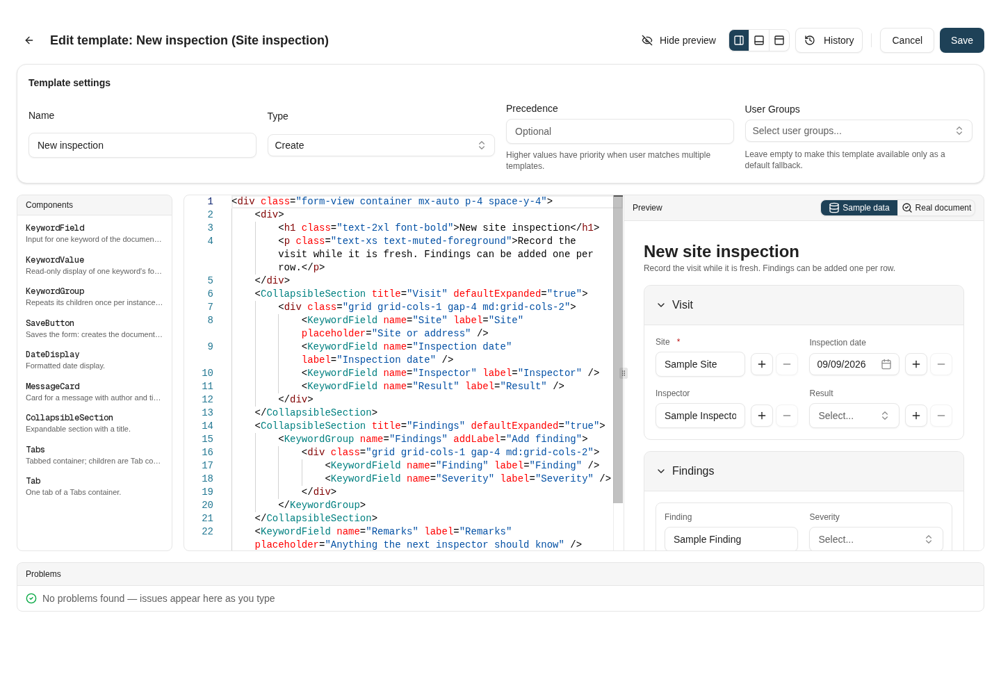
<Frame caption="The template designer: settings, the component reference, the source with live lint, and a preview that renders the template against sample data or a real document.">
  <img src="https://mintcdn.com/nobly/RnjHHDOJGZnvfhVB/images/guides/form-template.png?fit=max&auto=format&n=RnjHHDOJGZnvfhVB&q=85&s=9a63081338bc65886535eba116aa0b69" alt="The form template designer editing a create template, with the preview on the right showing sample data" width="1440" height="1000" data-path="images/guides/form-template.png" />
</Frame>

The designer is the same editor used for Caseflow templates, with a form-specific palette, lint and preview.

* **Start from** — a new template offers three starting points: **Scaffold from keywords** generates a field (or value, for preview templates) for every keyword of the document type, grouped the way its keyword configuration is; the **starters** are small generic layouts with placeholder keyword names; **Blank** is empty.
* **Components** — the palette lists the form components with their props; select one to insert it.
* **Problems** — the template is linted as you type: unknown components and props, a keyword component without a binding, keywords the document type does not have, malformed tags. Findings do not block saving, so clear the errors before you make the template the default: an unknown keyword, for example, renders as *Unknown keyword* on the form.
* **Preview** — renders the template as it will look. **Sample data** fills every keyword with a plausible value and lets you type into fields without saving anything; **Real document** loads an existing form document of the type by ID and shows the template read-only against its stored keywords, including group rows.
* **History** — every save stores a version. Open a version to compare it with the current source, load it into the editor, or restore it.
* **AI assistant** — where the AI template generation feature is enabled, describe the form you want or the change to make; the assistant knows the document type's keywords and the form components, and its suggestion is shown as a diff you accept or discard.

## Writing a template

A template is HTML. Tailwind utility classes are available for layout, and the form components are written as tags:

```html theme={null}
<div class="form-view container mx-auto p-4 space-y-4">
    <div>
        <h1 class="text-2xl font-bold">{{Site}}</h1>
        <p class="text-xs text-muted-foreground">{{document.documentTypeName}} — inspected {{document.documentDate}}</p>
    </div>
    <CollapsibleSection title="Visit" defaultExpanded="true">
        <div class="grid grid-cols-1 gap-4 md:grid-cols-2">
            <KeywordField name="Site" label="Site" placeholder="Site or address" />
            <KeywordField name="Inspection date" label="Inspection date" />
            <KeywordField name="Inspector" label="Inspector" />
            <KeywordField name="Result" label="Result" />
        </div>
    </CollapsibleSection>
    <CollapsibleSection title="Findings" defaultExpanded="true">
        <KeywordGroup name="Findings" addLabel="Add finding">
            <div class="grid grid-cols-1 gap-4 md:grid-cols-2">
                <KeywordField name="Finding" label="Finding" />
                <KeywordField name="Severity" label="Severity" />
            </div>
        </KeywordGroup>
    </CollapsibleSection>
    {{#if Remarks}}<MessageCard content="{{Remarks}}" author="{{Inspector}}" />{{/if}}
    <div class="mt-6 flex justify-end">
        <SaveButton label="Save" />
    </div>
</div>
```

Components bind to keywords **by name** (`name="Site"`) or **by keyword type ID** (`keywordTypeId="201"`). Use the ID when a keyword name contains characters the template grammar cannot carry — quotes, `>`, `/` — or looks like a number or `true`/`false`; the scaffold does this for you.

### The render scope

Placeholders resolve against the document being shown:

| Placeholder                                                                                                                                               | Resolves to                                                                                                                                                            |
| --------------------------------------------------------------------------------------------------------------------------------------------------------- | ---------------------------------------------------------------------------------------------------------------------------------------------------------------------- |
| `{{Keyword name}}` or `{{123}}`                                                                                                                           | The keyword's value, formatted for the reader (dates in local time, masked values as configured). Empty while creating.                                                |
| `{{Group.Keyword}}`                                                                                                                                       | A keyword of a single-instance group.                                                                                                                                  |
| `{{#each Group as row}}…{{row.Keyword}}…{{/each}}`                                                                                                        | The rows of a multi-instance group.                                                                                                                                    |
| `{{raw.Keyword}}`, `{{raw.Group.Keyword}}`                                                                                                                | The stored, unformatted value. Use it in conditions — `{{#if raw.Amount > 1000}}` — where a formatted `1,234.50` would not compare as a number — and in `DateDisplay`. |
| `{{document.name}}`, `{{document.id}}`, `{{document.documentTypeName}}`, `{{document.documentDate}}`, `{{document.storedDate}}`, `{{document.createdBy}}` | The document itself. Dates are shown for the reader; `raw.document` holds the stored values. Empty while creating.                                                     |
| `{{today}}`                                                                                                                                               | Today's date, `YYYY-MM-DD`.                                                                                                                                            |

Keywords hidden by configuration, or hidden for the current values by a [conditional keyword rule](/configuration/keyword-behaviour#conditional-keyword-rules), are left out of the scope and out of the form: neither a placeholder nor a component shows them.

### What the form enforces for you

A form template describes the layout; the keyword rules come from the document type and apply whether or not the template mentions a keyword:

* **Required keywords** must be filled before saving, including ones the template does not show.
* **Masks, lengths and datasets** come from the keyword type; cascading children follow their parent and read-only cascading children are derived automatically.
* **Autofill keyword sets** run when their primary keyword is entered, with the same choice and confirmation dialogs as the keyword panel.
* **Keyword defaults** of the document type pre-fill a new form.
* **Revision comments**: if the document type forces a comment, the save button asks for it first.
* **Duplicates**: if similar documents exist, the create asks before storing anyway.

## Where to read next

<Card title="Form components" icon="input-text" href="/forms/components" horizontal>
  Every component a form template can use, with props and examples.
</Card>

<Card title="Administration" icon="gear" href="/forms/administration" horizontal>
  Permissions, what users need, and how form documents behave in search, the viewer and integrations.
</Card>

<Card title="Templates and syntax" icon="code" href="/caseflow/templates" horizontal>
  The shared template engine: variables, conditionals, loops and expressions.
</Card>
